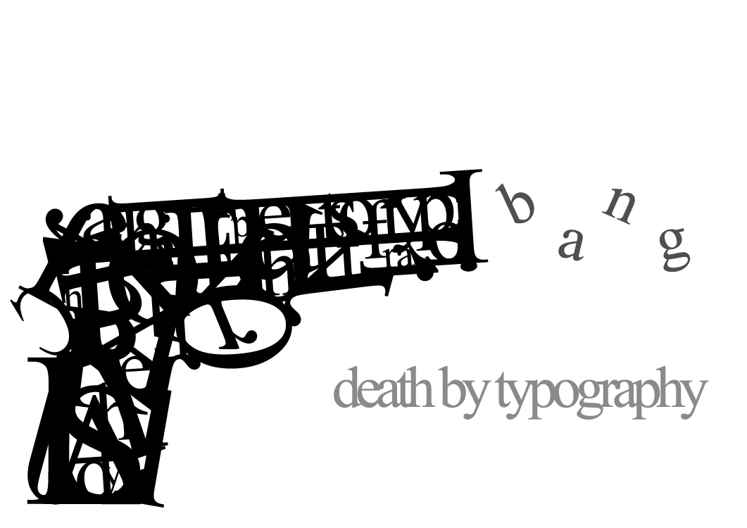
Whaaaat? Of course I am not sending a message. Who would think that? The gun is made up of letters for certain, but to a degree of unrecognizability. Not to say that it isn't well-done, just jumbled out that wazoo into a form that only has elements of letters. Placement is well enough, and the b a n g seems to wave like smoke, so that makes a wonderful picture.
A blog full of Typo
Wednesday, May 8, 2013
Way of the David
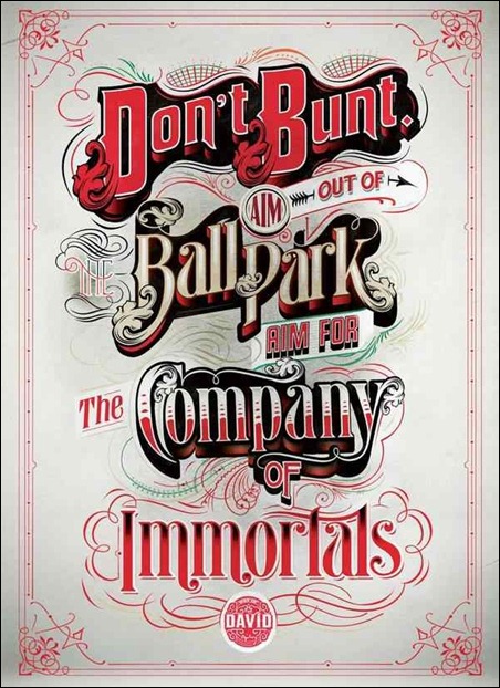
The text certainly transcends time-periods within a certain multi-decade range. This hearkens back to when sporting events were a bit more high-class in general. There are a bunch of different types of text involved. However, it works, because it gives a distinct different feel to each of the emphasized words as need be. So consider it a non-issue.
Obstacles
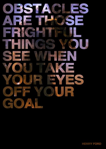
...I don't like it. Not necessarily bad, but I just am not a fan. Too much science textbook, and not enough contrast with the brown nebula segment. The text placement is also boring IMHO. Not static, but just bland. Perhaps to improve it, a more colorful nebula could've been used? Regardless, this needs spice to it. I give this an overwhelming... meh.
...Okay, Posters
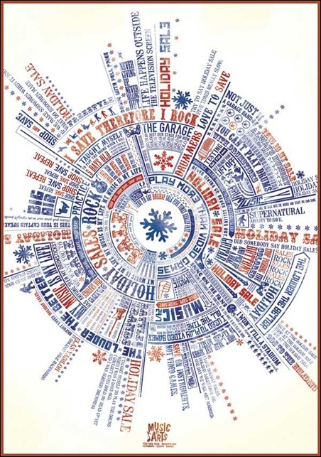
This spherical conglomeration of text looks like the cover to a pendulum album.
Actually, I believe it is informing us about some sort of music festival. As a flyer, it would do a poor job. But in regards to keeping me occupied, not so shabby. I get a fairground vibe from it, despite that snowflake in the center.
Robot Earth 3009
Iron Giant meets Sky Captain meets Typography... Gorgeous. Do I really have to write much more about this? Because I will be sitting here for the next few minutes in some sort of wonder. The way the bot is built is phenomenal like the phrase was designed with this purpose. The color scheme is close to a vintage Shepard Fairey, albeit with more green tints.
I'll be the brightest someday
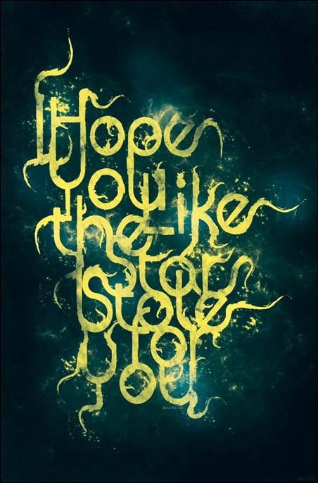
Alright, I will help you out: It says "I hope you like the stars I stole for you". Slightly cryptic, the letters hide within themselves, not lending to readability The style overall is neat, and slightly charming, but that would be a good tweak to make, just for the casual observer. The flowing text weaves in a pattern reminiscent of 'Starry Night", but less Van Gogh.
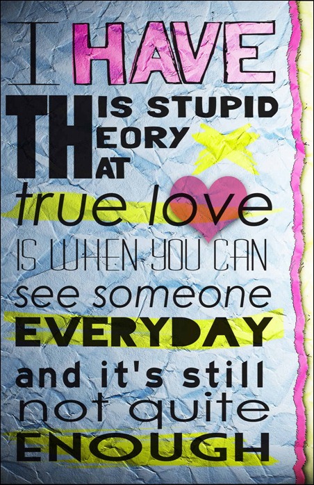
Stupid theory
Another creative showcase: referring to the triple use of the same "TH". It also looks very much like a highschool notebook doodle/bored activity, but also retains that refined look. The key is to make it obvious and intentional that you are mimicking a style, which I think comes through rather well here.
Subscribe to:
Comments (Atom)
