This reminds me of the futuristic style of "Meet the Robinsons" Seriously, check out the similarity:

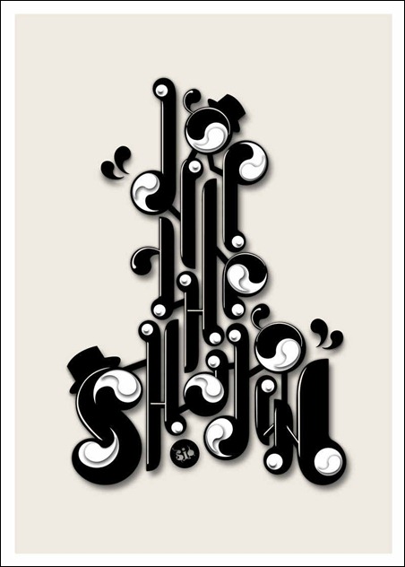
Obviously less color, and more lettering, but a neat facet. Anyways, back to the poster: It is also hard to pick out and read, and I would have passed it off as pure design if it was not inclusive of that S in the bottom corner. Ingenious style, but hard to "get"
No comments:
Post a Comment