Wednesday, May 8, 2013

Death By Typography

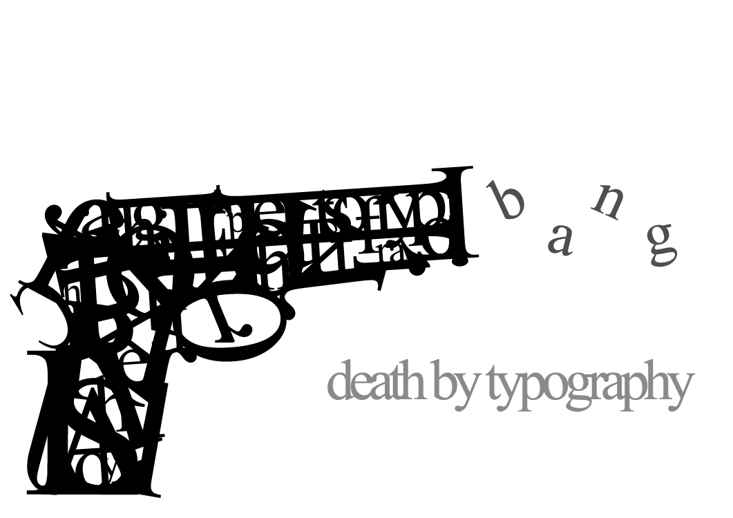
Whaaaat? Of course I am not sending a message. Who would think that? The gun is made up of letters for certain, but to a degree of unrecognizability. Not to say that it isn't well-done, just jumbled out that wazoo into a form that only has elements of letters. Placement is well enough, and the b a n g seems to wave like smoke, so that makes a wonderful picture. 

Way of the David

The text certainly transcends time-periods within a certain multi-decade range. This hearkens back to when sporting events were a bit more high-class in general. There are a bunch of different types of text involved. However, it works, because it gives a distinct different feel to each of the emphasized words as need be. So consider it a non-issue.

Obstacles

...I don't like it. Not necessarily bad, but I just am not a fan. Too much science textbook, and not enough contrast with the brown nebula segment.  The text placement is also boring IMHO. Not static, but just bland.  Perhaps to improve it, a more colorful nebula could've been used? Regardless, this needs spice to it. I give this an overwhelming... meh.

...Okay, Posters

This spherical conglomeration of text looks like the cover to a pendulum album.
Actually, I believe it is informing us about some sort of music festival. As a flyer, it would do a poor job. But in regards to keeping me occupied, not so shabby. I get a fairground vibe from it, despite that snowflake in the center. 

Robot Earth 3009

Iron Giant meets Sky Captain meets Typography... Gorgeous. Do I really have to write much more about this? Because I will be sitting here for the next few minutes in some sort of wonder. The way the bot is built is   phenomenal  like the phrase was designed with this purpose. The color scheme is close to a vintage Shepard Fairey, albeit with more green tints.

I'll be the brightest someday

Alright, I will help you out: It says "I hope you like the stars I stole for you". Slightly cryptic, the letters hide within themselves, not lending to readability  The style overall is neat, and slightly charming, but that would be a good tweak to make, just for the casual observer. The flowing text weaves in a pattern reminiscent of 'Starry Night", but less Van Gogh.

Stupid theory

Another creative showcase: referring to the triple use of the same "TH". It also looks very much like a highschool notebook doodle/bored activity, but also retains that refined look. The key is to make it obvious and intentional that you are mimicking a style, which I think comes through rather well here.

Drop the Shadow

This reminds me of the futuristic style of "Meet the Robinsons" Seriously, check out the similarity:
Obviously less color, and more lettering, but a neat facet. Anyways, back to the poster: It is also hard to pick out and read, and I would have passed it off as pure design if it was not inclusive of that S in the bottom corner. Ingenious style, but hard to "get"


Have a very good day: An appreciation post

Okay! Calling atttention to the one detail that makes this fabulous. The sentence completes itself in our heads, but we don't see an explicit placement of the article "A", until we see the color shift among the compacted letters. Is that not cool? ARE YOU NOT AMUSED?

The past and the future make the present inspiring

Retro with a new-design twist. Innovative, for certain. More design then type here, but the repetition running off the page mixed with the highlighted important text make this a very viable typography piece. A nice touch of gradient, but segmented by line. Well, I said retro earlier, but this could be 80's-90's in regards to pure color.

Most of the Clients don't know what typography is

How on earth do you follow this? I get the point, and it is conveyed well once you read it, but that initial reading is a nightmare. The colors add weight and screw with the hierarchy of what word comes next. The linear diagonal color variance is very cool though, and it carries a mild undertone of disgruntlement

Nothing can stop a good idea

The gradients on this are... wait for it... a good idea. This is a thrilling mix of type and cursive linkage, and some of the lines just run away. I really think this is one of the cooler things to date on this blog. The placement is curious, both centered and slightly unbalanced. And the way the letter fit together, you almost feel like following the lines, and not the words. Well done, can I have another T-shirt?

Tuesday, May 7, 2013

Typographic dope

This is a departure form standard typography, looking more into picture forming words, rather then the opposite. The intertwining is well-executed, and the color scheme manages to not be too cliche, taking on an odd chromatic vibe. Aside from that, not much more to say. I think it is worth looking at, so have at it!

The Cult of the Ugly

So, there is information in there somewhere. Any help finding it would be appreciated. It looks neato, but by all things good and holy it is difficult to make out what they are trying to convey. The problem is the text size and how it contrasts so brightly against the other colors. Visually appealing, but confusing.

Watchmen

This is a great example of how spacing and size can really add emphasis. You really can tell the emotions behind each of the words that are somehow made special through either size change, or isolation from the rest. The mental read-through really differs in volume and the words along with the meaning are clearly defined and seen. Add that to the slant, and we can get away with middle text, although it is far from static.

Monday, May 6, 2013

Font review: Sylfaen

Kidding! Well. I could do either one. The picture gives most of the details about the font, so let's focus on layout. The s-curve is brilliant, because it reflects the shape guideline, and the first letter in the name. It also lends itself to plenty of  usable space for the information. And again, no Illustration, but an eye-catching design. Bravo. Go through and read it, why don't you?

http://netdna.webdesignerdepot.com/uploads/typography_posters/12.jpg (In case you can't read it from here)

Better then Nothing? Better then a bunch

So. I hope you like circles! A bunch of cool stuff is found on deviantart. So yes, that is where it comes from. It was designed for a company, but not many more details were given. Are we to assume that it is in use? The link does little to clarify. Anyways, analysis time! Readable? check. Eye catching? check. Unique look? check. Cool enough for me to write about it? well... yeah check. The circles are used effectively without obvious bumpy edges or cut circles, and that is certainly polished and professional. A slight weight to the bottom leads the eye to the company text in the lower corner. And guess what! It's in Helvetica.

Hendrix

Ah, the iconic Hendrix face. This poster oozes the 60's, with a much more limited palate of color than others. The illustration almost passes for more text, but not so much so that it is lost. I will admit to difficulty in reading it, but with some effort, you can get by. Or not. Some places are indecipherable. So, this gets points for being Hendrix, but loses others for difficulty in reading.

More Bauhaus

So. Pipes. Getting some pipe-esq feelings from this. But this looks incredible IMHO. We have already seen a previous Bauhaus piece, but this in not by the same person. And I do not think it was meant to be read at all, but to make a design with the textual limitations. Suffice to say, it looks "Baus". Okay, I apologize for that incredibly tacky joke.

Punk Typography

Slightly more Illustrative then the average, punk typography is a sight to behold. The counter-culture movements always yield interesting results, and often become the culture, or at least well known. This embraces that spirit, with many details that would make someone cringe, would they be used in a non-punk piece. However, all together, they create a neat vibe, one of schooling and perhaps frustration. Not to mention the piece itself has a neat meaning to it, read it through, it explains itself well.

BAUHAUS

This is the last one from longdesignzzz that I willl post, but this is one of the coolest things I have seen so far. Aside from the watermark, this is a very neat display of that particular font "Bauhaus". No words are explicitly spelled out, although the letters to the font name are all there. Color is limited in a good way, and the shapes are sporadic with neat variance. I should check to see if longdesignzzz has shirts for sale.


Not that I can tell D:

MInd-Boggling

From the same guy as the last post, we can see a visually similar style with text manipulation. In fact, the artist openly says that it is another go at that style. In this case, it is two words as opposed to one, and the word "boggling" is a tad bit difficult to see. However, as a cohesive whole, this is still pretty cool, and could be seen on a t-shirt. In fact, I want one. The line-work remains well done, and the shapes are more varied, to a good result.

Hey! Helvetica again!


Helvetica has been stated (By me, actually) to be one of the most versatile fonts ever, due to the neutrality  But here we see it taken a step further, and it develops onto itself in a neat design, with the Swiss flag represented. Makes sense, considering the origins of the font, but I also feel that they are hinting at Swiss design here and there. The color scheme supports it, as well as the linear setup. As far as the font goes, Helvetica is a neat "Sculpting" font. Once again, due to the absolute bland form that makes it up. However, it allows it to be the easiest to manipulate.

Typography Is Tedious

This is a proper example of text manipulation, but without it trying to be something else. Don't get me wrong, clever text manipulation into a picture is neat, but done far too often. Most of the time I find that the most visually attractive pieces are able to be just words, and not picture. Just neat arrangements, which this piece is. There is an odd mix of capital and lower-case letters, and the line-work is phenomenal  Despite the jumbling, you can still get a handle on what the word is, so I would say this is a success  This piece was originally posted on deviantart, and the artist has done a few others (Coming right up!)


Original Link: http://longdesinzzz.deviantart.com/