And this is the same title for Red version, the anime, the card game, all the way to the current titles, X and Y
However, the Japanese titles are significantly more varied. Here is the title for Red version

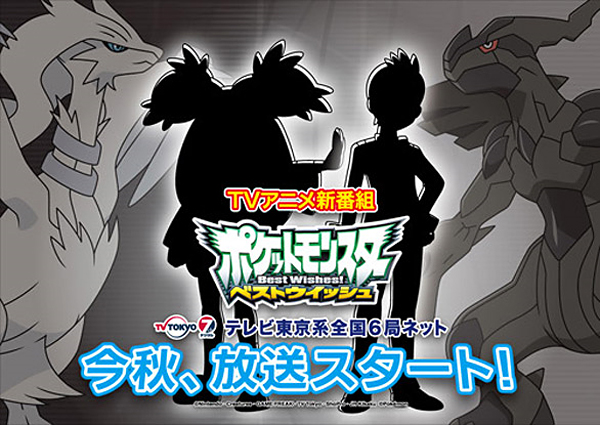
As for the anime:
And the latest game-

And we can see the difference. The lettering is varied in color, size, and adornment, whereas we can see the whopping progress made by Nintendo of America:
I just find this intresting. I will post about the effects in a bit. But for now, I will leave you to your theories.
I think we get more attached to that kinda thing, we love logos and that's the Pokémon logo
ReplyDelete