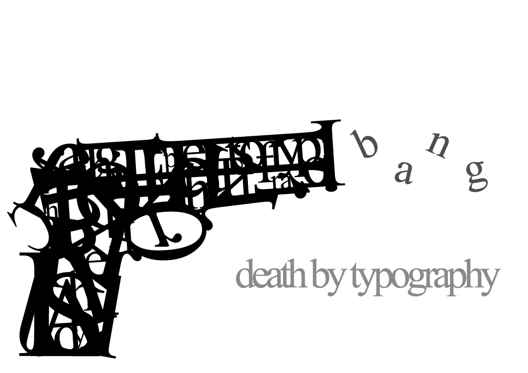
Whaaaat? Of course I am not sending a message. Who would think that? The gun is made up of letters for certain, but to a degree of unrecognizability. Not to say that it isn't well-done, just jumbled out that wazoo into a form that only has elements of letters. Placement is well enough, and the b a n g seems to wave like smoke, so that makes a wonderful picture.
Wednesday, May 8, 2013
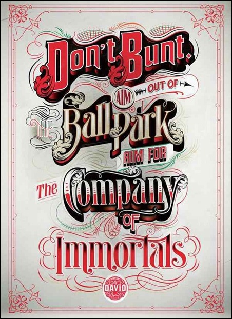
Way of the David
The text certainly transcends time-periods within a certain multi-decade range. This hearkens back to when sporting events were a bit more high-class in general. There are a bunch of different types of text involved. However, it works, because it gives a distinct different feel to each of the emphasized words as need be. So consider it a non-issue.
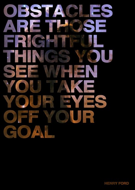
Obstacles
...I don't like it. Not necessarily bad, but I just am not a fan. Too much science textbook, and not enough contrast with the brown nebula segment. The text placement is also boring IMHO. Not static, but just bland. Perhaps to improve it, a more colorful nebula could've been used? Regardless, this needs spice to it. I give this an overwhelming... meh.
...Okay, Posters
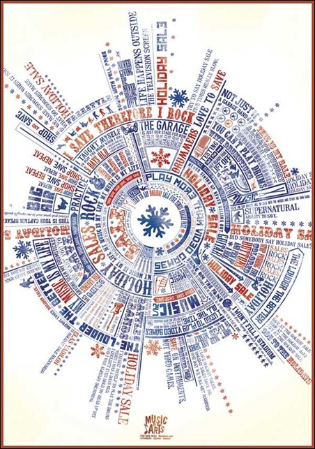
This spherical conglomeration of text looks like the cover to a pendulum album.
Actually, I believe it is informing us about some sort of music festival. As a flyer, it would do a poor job. But in regards to keeping me occupied, not so shabby. I get a fairground vibe from it, despite that snowflake in the center.
Robot Earth 3009
Iron Giant meets Sky Captain meets Typography... Gorgeous. Do I really have to write much more about this? Because I will be sitting here for the next few minutes in some sort of wonder. The way the bot is built is phenomenal like the phrase was designed with this purpose. The color scheme is close to a vintage Shepard Fairey, albeit with more green tints.
I'll be the brightest someday
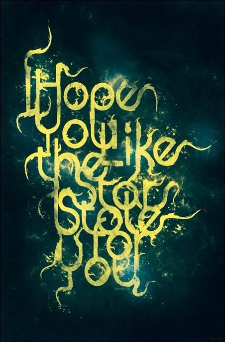
Alright, I will help you out: It says "I hope you like the stars I stole for you". Slightly cryptic, the letters hide within themselves, not lending to readability The style overall is neat, and slightly charming, but that would be a good tweak to make, just for the casual observer. The flowing text weaves in a pattern reminiscent of 'Starry Night", but less Van Gogh.
Stupid theory
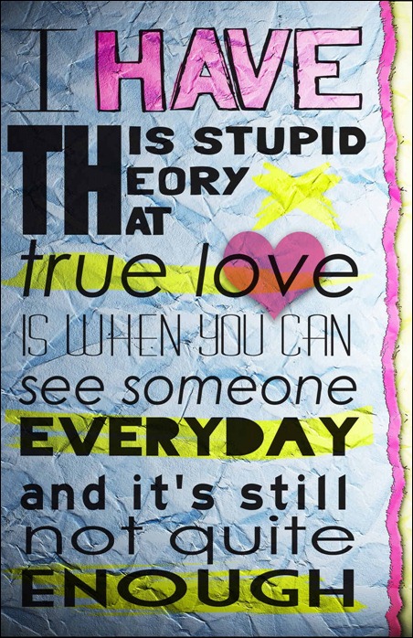
Another creative showcase: referring to the triple use of the same "TH". It also looks very much like a highschool notebook doodle/bored activity, but also retains that refined look. The key is to make it obvious and intentional that you are mimicking a style, which I think comes through rather well here.
Drop the Shadow
This reminds me of the futuristic style of "Meet the Robinsons" Seriously, check out the similarity:
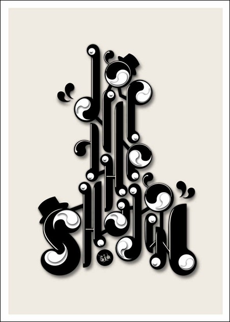
Obviously less color, and more lettering, but a neat facet. Anyways, back to the poster: It is also hard to pick out and read, and I would have passed it off as pure design if it was not inclusive of that S in the bottom corner. Ingenious style, but hard to "get"
Have a very good day: An appreciation post
Okay! Calling atttention to the one detail that makes this fabulous. The sentence completes itself in our heads, but we don't see an explicit placement of the article "A", until we see the color shift among the compacted letters. Is that not cool? ARE YOU NOT AMUSED?
The past and the future make the present inspiring
Retro with a new-design twist. Innovative, for certain. More design then type here, but the repetition running off the page mixed with the highlighted important text make this a very viable typography piece. A nice touch of gradient, but segmented by line. Well, I said retro earlier, but this could be 80's-90's in regards to pure color.
Most of the Clients don't know what typography is
How on earth do you follow this? I get the point, and it is conveyed well once you read it, but that initial reading is a nightmare. The colors add weight and screw with the hierarchy of what word comes next. The linear diagonal color variance is very cool though, and it carries a mild undertone of disgruntlement
Nothing can stop a good idea
The gradients on this are... wait for it... a good idea. This is a thrilling mix of type and cursive linkage, and some of the lines just run away. I really think this is one of the cooler things to date on this blog. The placement is curious, both centered and slightly unbalanced. And the way the letter fit together, you almost feel like following the lines, and not the words. Well done, can I have another T-shirt?
Tuesday, May 7, 2013
Typographic dope
This is a departure form standard typography, looking more into picture forming words, rather then the opposite. The intertwining is well-executed, and the color scheme manages to not be too cliche, taking on an odd chromatic vibe. Aside from that, not much more to say. I think it is worth looking at, so have at it!
The Cult of the Ugly
So, there is information in there somewhere. Any help finding it would be appreciated. It looks neato, but by all things good and holy it is difficult to make out what they are trying to convey. The problem is the text size and how it contrasts so brightly against the other colors. Visually appealing, but confusing.
Watchmen
This is a great example of how spacing and size can really add emphasis. You really can tell the emotions behind each of the words that are somehow made special through either size change, or isolation from the rest. The mental read-through really differs in volume and the words along with the meaning are clearly defined and seen. Add that to the slant, and we can get away with middle text, although it is far from static.
Monday, May 6, 2013
Font review: Sylfaen
Kidding! Well. I could do either one. The picture gives most of the details about the font, so let's focus on layout. The s-curve is brilliant, because it reflects the shape guideline, and the first letter in the name. It also lends itself to plenty of usable space for the information. And again, no Illustration, but an eye-catching design. Bravo. Go through and read it, why don't you?
http://netdna.webdesignerdepot.com/uploads/typography_posters/12.jpg (In case you can't read it from here)
Better then Nothing? Better then a bunch
So. I hope you like circles! A bunch of cool stuff is found on deviantart. So yes, that is where it comes from. It was designed for a company, but not many more details were given. Are we to assume that it is in use? The link does little to clarify. Anyways, analysis time! Readable? check. Eye catching? check. Unique look? check. Cool enough for me to write about it? well... yeah check. The circles are used effectively without obvious bumpy edges or cut circles, and that is certainly polished and professional. A slight weight to the bottom leads the eye to the company text in the lower corner. And guess what! It's in Helvetica.
Hendrix
Ah, the iconic Hendrix face. This poster oozes the 60's, with a much more limited palate of color than others. The illustration almost passes for more text, but not so much so that it is lost. I will admit to difficulty in reading it, but with some effort, you can get by. Or not. Some places are indecipherable. So, this gets points for being Hendrix, but loses others for difficulty in reading.
More Bauhaus
So. Pipes. Getting some pipe-esq feelings from this. But this looks incredible IMHO. We have already seen a previous Bauhaus piece, but this in not by the same person. And I do not think it was meant to be read at all, but to make a design with the textual limitations. Suffice to say, it looks "Baus". Okay, I apologize for that incredibly tacky joke.
Punk Typography
Slightly more Illustrative then the average, punk typography is a sight to behold. The counter-culture movements always yield interesting results, and often become the culture, or at least well known. This embraces that spirit, with many details that would make someone cringe, would they be used in a non-punk piece. However, all together, they create a neat vibe, one of schooling and perhaps frustration. Not to mention the piece itself has a neat meaning to it, read it through, it explains itself well.
BAUHAUS
This is the last one from longdesignzzz that I willl post, but this is one of the coolest things I have seen so far. Aside from the watermark, this is a very neat display of that particular font "Bauhaus". No words are explicitly spelled out, although the letters to the font name are all there. Color is limited in a good way, and the shapes are sporadic with neat variance. I should check to see if longdesignzzz has shirts for sale.
Not that I can tell D:
MInd-Boggling
From the same guy as the last post, we can see a visually similar style with text manipulation. In fact, the artist openly says that it is another go at that style. In this case, it is two words as opposed to one, and the word "boggling" is a tad bit difficult to see. However, as a cohesive whole, this is still pretty cool, and could be seen on a t-shirt. In fact, I want one. The line-work remains well done, and the shapes are more varied, to a good result.
Hey! Helvetica again!
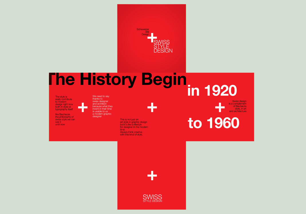
Helvetica has been stated (By me, actually) to be one of the most versatile fonts ever, due to the neutrality But here we see it taken a step further, and it develops onto itself in a neat design, with the Swiss flag represented. Makes sense, considering the origins of the font, but I also feel that they are hinting at Swiss design here and there. The color scheme supports it, as well as the linear setup. As far as the font goes, Helvetica is a neat "Sculpting" font. Once again, due to the absolute bland form that makes it up. However, it allows it to be the easiest to manipulate.
Typography Is Tedious
This is a proper example of text manipulation, but without it trying to be something else. Don't get me wrong, clever text manipulation into a picture is neat, but done far too often. Most of the time I find that the most visually attractive pieces are able to be just words, and not picture. Just neat arrangements, which this piece is. There is an odd mix of capital and lower-case letters, and the line-work is phenomenal Despite the jumbling, you can still get a handle on what the word is, so I would say this is a success This piece was originally posted on deviantart, and the artist has done a few others (Coming right up!)
Original Link: http://longdesinzzz.deviantart.com/
Tuesday, April 9, 2013
Titanic Resemblence
Okay, bad puns aside, I am taking a break from the typical posts to bring to light a similarity between our class work and what can be readily found on google
This is a fantastic example of how to illustrate with only letters, and fully convey what happens in whatever this is for. Things that are worth mentioning:
The icebergs are not just a singular color, but change to add further depth and form
The text of "Titanic" is done well enough that you can read it, but still have enough to read.
The background color is a very nice gradient, and brings emphasis to the key points.
Finally, it is rather centered, without feeling static.
So, this is something to reference when stuck, and is a good example of how to use text to illustrate.
Tuesday, March 19, 2013
Font Review- Eldorado
Nope, not the city. Nope, not the movie. Nor was it used in either. But here we are.
Line variations dominate the scene in this font. And of which there are plenty. But mostly in atypical spots on the letters, which I am just fine with. Also, the loop within the w is... sexy, for lack of better terminology. This font can be used to really add some subtext to whatever you are writing. Of what subtext, I am not quite sure how to put it into words. Just an oddly prominent feeling, like there is more to be discovered. So perhaps in mystery novels, or clues given on a flyer in a mass-scavenger hunt. Then, I guess the name makes more sense, Eldorado, the city of legend. It makes sense that it's font would have some sort of mystery to it.
Oh, and here is it in use-
Woah... I mean Font review- Bradley Initials
Well. Um. This font gives me mixed feelings. I like it, but also I find aspects to be annoying. Um. It is odd, that's all. Oh right, you probably want to see it, so here
Am I the only one who sees this as very weird? It is so stylized, I find it hard to describe accurately So, new type of blog post- Type Gallery!
Am I the only one who sees this as very weird? It is so stylized, I find it hard to describe accurately So, new type of blog post- Type Gallery!
Font Review- Avalon
I really need to learn calligraphy. Until I do, however, I can just use this font Avalon. Inspired by the handwriting of Friedrich Neugebauer, this is a nice take on the "fancy script" style.
(I have been speed-blogging, gimme a break)
There is a vast amount of style. The typical over-the-top loops are not present, and it just looks... pretty. Well, there are hundreds of other descriptors that would fit better, but pretty is a good one for this writing. By far designed to be used in fancy and high-class situations, this has a more pointed look and is very easy to read despite all of the excess line usage. AND- believe it or not, the website didn't have a usage photo, so yay, less work!
(I have been speed-blogging, gimme a break)
Font Review- Aardvark
Well, it just may be me, but this font reminded me of the song intermission by Philadelphia chickens
But I am pretty sure that is just me. Moving on, here is the font-
But I am pretty sure that is just me. Moving on, here is the font-
Oh! and the best part about this website- it already gives you a usage example. Makes it harder for me, as I have to come up with ANOTHER, but whatever, as long as the information is given out-
Retro is fine and dandy, but I can see this font in some form of underground music night at a hipster cafe. This font is not too flamboyant, but you can pick it out. A solid font, so a small round of applause for Font Bureau. *clapclapclapclap*
Moving on- Font Bureau
That wraps it up for LucasFonts, at least for the time being. Now we are going to take some glances at the designs and type available from the company- "Font Bureau".
http://jump.dexigner.com/directory/13819
And oh boy, there are a bunch. And to top it off, instead of making a whole new font to just add in a different thickness or a tad bit of serif (coughLucasFontscough), they instead have all the differing styles for that one design. We may be here a while. Depends if I get bored.
Font Review- Punten
Ah. This is a font I can get behind. It may have some variants that remind us of Jesuslovesyouall, but it also has variants that look incredible.
The picture says it all, actually: use at your own risk. We can also see a bit of suggestion as to where this font can be used: books like the Harry Potter series, or other things that need a cool hand-written style font with an obvious flair. I do not like the variant 4 lines down, but the rest could be used creatively. I may go download this one.
Font Review- Jesuslovesyouall
Curious title. Even more curious font. while I admire the edginess of it, I find it hard to easily use in anything.
Particularly the bit in the middle that says Amen: it is so all-over the place. I don't have much to say really, other then: this font has a niche for sure, good luck finding it.
Finally! Font review- Nebulae
I may have been a little bit hard on them. I can see plenty of marketable area for those fonts, and they aren't ugly, just bland. But for a font review... ugh. HOWEVER- LucasFonts does have a few unique looks that can still be conceivably used in public, the first of which is Nebulae:
Would you agree- that looks pretty neat. The color scheme, although it was derived from the website, works extraordinarily well, but it is not limited to just orange. A blue or green could work just as well. The font itself may be a tinge bit difficult to read up close, but not that bad at all when the reader is further away. This font would be right at home in flyers for science festivals, or perhaps a particle effects demonstration. Pull this one off correctly, and it will have a very cool feel.
Would you agree- that looks pretty neat. The color scheme, although it was derived from the website, works extraordinarily well, but it is not limited to just orange. A blue or green could work just as well. The font itself may be a tinge bit difficult to read up close, but not that bad at all when the reader is further away. This font would be right at home in flyers for science festivals, or perhaps a particle effects demonstration. Pull this one off correctly, and it will have a very cool feel.
Just like the Sans-
Here they are, all the fonts on Lucas fonts that look like or are based off of the sans-
The mix- They added one or two serifs...
The Serif- Now everything has serifs...
Corpid- The letter line is less fat
Taz- The letters are a tiny bit more skinny
Spiegel- Um, I guess my font eye is not functioning that well. Can't really tell
Sun- ...
For visual reference- http://jump.dexigner.com/directory/16513
The Sans
Okay, so this one is slightly confusing, and i may have my research wrong. But I am pretty sure that "The Sans" is just like practically any other sans-serif font.
Unless Lucasfonts created this way back when basic fonts were being created, I am going to have to say blah. While it is not obtrusive, and very neat, it is so very boring. To make things worse, there are a bunch of other fonts that look just like it with minuscule variances.
Unless Lucasfonts created this way back when basic fonts were being created, I am going to have to say blah. While it is not obtrusive, and very neat, it is so very boring. To make things worse, there are a bunch of other fonts that look just like it with minuscule variances.
Monday, March 18, 2013
LucasFonts
http://jump.dexigner.com/directory/16513
Okay... so there are cool fonts agencies that have a bunch of designs, and there are ones that are not so skilled. LucasFonts is one of these. The fonts have very little deviation from each other, with only a few fonts that stick out. Strap yourself in, we are going to have some fun critiques coming up.
Okay... so there are cool fonts agencies that have a bunch of designs, and there are ones that are not so skilled. LucasFonts is one of these. The fonts have very little deviation from each other, with only a few fonts that stick out. Strap yourself in, we are going to have some fun critiques coming up.
Font Review- Landmark.

http://www.typography.com/?path=head
Okay, I love this one. This is one of the Art-Deco influenced fonts, and it has great potential. The compatibility with colors, the design, and the general feel are some of the best I have seen. While versatility is not its strong point, it has a rather large niche, and it fills it wonderfully. Definitely more upper-class, but could be used in a cafe on main street in a mid-sized town. I have less content then I would like, but I just do really like this font. I might post more about it if I feel more inclined.
Font Review- Idlewild

http://www.typography.com/fonts/font_overview.php?productLineID=100043&path=head
Idlewild is advertised as being comfortable wherever it is place. I would mostly agree, it is a rather versatile font. The Sans-Serif provides a smooth, unobtrusive text that can be used for lots of subtitling and the like. It fits right at home in technical drawing manuals, or plain instructional pamphlets. My main concern though, it it is somewhat wide. And because of that, the versatility may actually be reduced somewhat, say in narrow spaces, or perhaps contrasted with Algerian. So maybe not as useful as advertised, but use with discretion, and you shouldn't go wrong.
Saturday, March 16, 2013
Font Review: Hoefler Text
Next up is the either the namesake or the mascot of Hoefler & Frere (not sure which one): Hoefler Text.
Again, not able to actually type it in the text because it is not standard. So instead, have the screenshot/link combo:
Again, not able to actually type it in the text because it is not standard. So instead, have the screenshot/link combo:
http://www.typography.com/fonts/font_overview.php?productLineID=100010&path=head
This review is short. Again, I like it because it is rather classic. It does the job, can be written small, and in various locations without sticking out. BUT. It is not terribly bland either, with room for interesting design elements. So there you go, a ood filler font. However, with Times New Roman as a free font, you shouldn't really bother getting it unless you fall in love with the nuances.
Font review: Didot
Normally, this would be the point where you would see the review written out in this font. But, that is harder to do, as this font is not default. So, this link will have to do, alongside this screenshot:
http://www.typography.com/fonts/font_overview.php?productLineID=100004&path=head
Now wait a minute, I believe we have all seen this font before? Am I correct? I should be. Didot has a very Similar form akin to many different types of fonts. While it is true that it did not originate from Hoefler & Frere, they currently own it. This font frequents magazine pages, and the occasional brochure. Quite honestly, I like it because of it being a classic, with Hoefler & Frere giving it the occasional tweak to keep it up with the times.
Hoefler & Frere-Jones
I interrupt the font reviews to bring you a set of design agencies that I have grown to love. The subject this week is the design agency Hoefler & Frere-Jones.
The reason I picked them is because the majority of the fonts they create have a very cool and sophisticated feel. Some appear art-decoish, while others could be found on the window of some high-class shop on main street. But this is not the only type, and some more common or even retro styles can be found. Some fonts that they have made that particularly catch my eye are the Didot, the namesake type: Hoefler text, the Landmark font, and the Idle wild. Why I like each of thee is coming up in the next 4 font reviews. Here is the link to their website, if you want to check it out.
Notice the link. Maybe a bit pretentious? But I think they earned it: http://www.typography.com/?path=head
Wednesday, March 13, 2013
Font Review- Agency FB
Agency FB, the narrow font used for all of your squished textual needs. I will be honest, this one is also hard to read, but not as bad as most. It is a sans-serif font that is condensed in a horizontal fashion. The type is monospaced, meaning that it has the same width from letter to letter. This type of font is best used in some military or combat-based setting. It has a look to it that takes advantage of a design principle of vertical height, implying power. We can see its usage in the military setting from the overwhelming presence it has in the game "Call of Duty: Black Opps 2", where the font is the primary lettering of the game itself. Personally, I like the font, I don't find it too obnoxious, and it has a more polished, designish look than most.
Font Review- Algerian
Algerian is a rarely used font, and because of that, I am reviewing it. I will give a basic descriptions (with pictures, don't you worry) and possible legitimate usages.
Algerian is a Serif font that takes its design from medieval influences. it is somewhat reviled because of how often it was used for a time. The biggest concern is how it takes up so much space.
Generic Phrase in this font
Algerian is a Serif font that takes its design from medieval influences. it is somewhat reviled because of how often it was used for a time. The biggest concern is how it takes up so much space.
Generic Phrase in this font
I find this phrase a bit
odd, and to be honest, will probably not use it that often. The
all-capitals is irksome, and I sound
like i am shouting all the time. I can however, see where it would be useful. If you take it back to its roots in medieval
text, then it can be used to a degree of efficacy. Beyond that, if you want to
be annoying and slightly difficult to read, then this font is for you.
Ideal setting-
Monday, March 11, 2013
An interesting cultural phenomenon
Something I have noticed, that I think is worth calling attention to. There is a stark difference in the typography in the title of the Pokemon games between America and Japan. The American one, and I am sure we all recognise, is this-
And this is the same title for Red version, the anime, the card game, all the way to the current titles, X and Y
However, the Japanese titles are significantly more varied. Here is the title for Red version
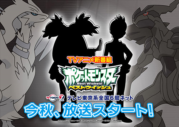
As for the anime:
And the latest game-
And we can see the difference. The lettering is varied in color, size, and adornment, whereas we can see the whopping progress made by Nintendo of America:
I just find this intresting. I will post about the effects in a bit. But for now, I will leave you to your theories.
Thursday, March 7, 2013
Covering what I missed
So, I had a little incident with a incredibly nasty stomach bug, that I got over... AND THEN IT CAME BACK. Suffice to say, I missed a "lecture" day and a work day in typography. I did get some notes on what I missed, but here is the gist of what I missed. i plan to write it out and expound if possible. Here goes:
Part 1- Type Anatomy.
So the main idea covered was on type anatomy, and I will be researching what each term means, and the applications. They are all derived from this diagram
In alphabetical order-
Ascent- how much the letter goes above the cap height
Ascender height- the measurement of the ascent, ie how much it "ascends"
Base line- The line on which every letter rests
Cap height- The next highest contact line
Descent- Going below the baseline
Descender Height- How far below the baseline the letter goes
Mean line- The highest the standard part of a letter goes
Median- the middle of all letter heights.
Wednesday, March 6, 2013
What IS Swiss design?
While often I have been shown Swiss design, I have been curious as to what actually constitutes Swiss design. You can easily recognise it, but there are elements that are key to identification. Firstly, bold colors on white-
Secondly, there are frequently slanted designs and long lines. At its core, this looks similar to such:
And finally, there is the bold text and bold letters, with very little gradient. These typically have a high-contrast color scheme:
And finally, there is the bold text and bold letters, with very little gradient. These typically have a high-contrast color scheme:
Subscribe to:
Comments (Atom)
